UI/UX Design Company

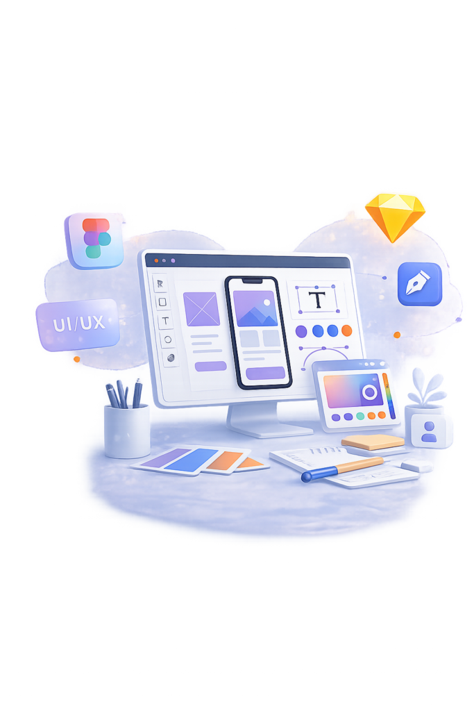
UI/UX design is the practice of researching how people will actually use a product, then shaping every screen, interaction, and transition around that evidence rather than around a designer’s personal taste. A UI/UX design company earns its fee by catching the expensive mistakes before a single line of code is written: the confusing checkout flow, the onboarding screen nobody finishes, the dashboard that looks polished in a pitch deck and falls apart the moment real data fills it. Good UX work is different from decoration because it starts with a question, what is this user trying to accomplish, and what is stopping them and only reaches for color, type, and layout once that question has a real answer. SoftCurators runs design as its own discipline, with its own research, its own review checkpoints, and its own deliverables, rather than treating it as a visual pass bolted onto a mobile app development or web development project. That separation matters because a design built in isolation from engineering constraints tends to look great in Figma and fall apart in the browser so our design team works from a shared understanding of what’s technically feasible before high-fidelity screens are finalized, then hands off files that a development team can build from without guesswork.

Request a Free Quote

    Satisfaction
    70 %
    Happy Clients
    50 +
    Years Experienced Team
    5 +
    Team Members
    40 +

    Our UI/UX Services |

    image

    UX Research & Strategy

    We analyse user behaviour, goals and problems to create a strong design foundation. User personality , Stakeholder interviews, Journey mapping, UX audits & research, Competitive analysis
    image

    UI Design & Prototyping

    We turn our understanding into visually stunning and functional interfaces. Web & mobile app design, High-fidelity mockups, Wireframes & interactive prototypes, Design systems & pattern libraries and accessibility
    image

    Mobile & Responsive Design

    We ensure every screen, from mobile to desktop delivers a smooth experience. iOS & Android UX, Responsive web UI, Cross device consistency
    image

    UX Redesign & Optimization

    Fix outdated or underperforming interfaces with a fresh, modern experience. Problem solving evaluation, Conversion optimization, Interaction design
    image

    UI/UX for Complex Systems

    Simplify enterprise dashboards, CRMs or heavy data apps with natural workflows. SaaS platforms, Admin panels, Workflow automation tools

    image

    Branding

    We don’t just build an app, web platform, or software, we build a brand. A strong brand connects, sounds and sells more effectively than any product alone. At SoftCurators, we help you go beyond development to create a powerful digital identity that stands out and drives long-term success.


    A project that starts as a prototype to test a concept with early users looks nothing like a redesign of a system that already has thousands of daily users and years of accumulated technical debt we scope each one differently rather than running every client through the same template.

    Our Clients

    Our UI/UX Design Process

    image

    Discovery and stakeholder alignment

    We sit down with the founder or product owner to define what success actually looks like a conversion number, a support-ticket reduction, a specific user task completed faster before opening any design software.
    image

    User research and persona development

    Interviews, surveys, or analysis of existing usage data build a picture of who the real users are, distinct from who the business assumes they are.
    image

    Information Architecture & User Flows & Wireframing

    We map out how someone moves through the product from entry point to goal, catching structural problems too many steps, missing states, dead ends while they’re still cheap to fix on a whiteboard. Low-fidelity layouts test the structure and hierarchy of each screen without visual styling distracting from whether the logic actually works.
    image

    High-fidelity UI design & Interactive prototyping with usability testing

    Wireframes become real screens with a defined type scale, color system, spacing rules, and component library, built to be consistent and reusable rather than designed screen by screen. A clickable prototype gets put in front of real target users, and we watch where they hesitate, misclick, or give up this is where assumptions get corrected before development money is spent
    image

    Developer handoff.

    Finished designs are packaged with specs, a component library, and interaction notes so the engineering team building the product whether that’s SoftCurators’ own development team or a client’s in-house team can build to the design without guessing at pixel values or edge cases.
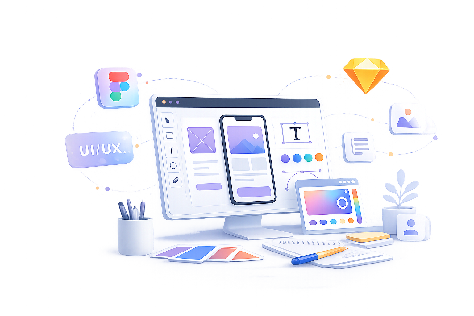
    Designing for Accessibility

    Accessible design means building interfaces that people using screen readers, keyboard-only navigation, or assistive input devices can actually operate, not just interfaces that pass a visual color check. We design against the Web Content Accessibility Guidelines (WCAG) 2.1 AA standard as the working baseline for every project, because it’s the benchmark referenced most often in accessibility law and procurement requirements across the US, UK, and EU. 

    In practice, that standard shapes specific design decisions rather than sitting as an abstract policy. Text and interactive elements are checked against a minimum contrast ratio of 4.5:1 for normal text and 3:1 for large text and UI components, verified with tools like the WebAIM contrast checker rather than eyeballed. None of this is a separate accessibility phase bolted onto the end of a project it’s checked at the wireframe stage, the high-fidelity design stage, and again during usability testing, because catching a contrast failure after development is underway costs far more than catching it in Figma. Every interactive element buttons, form fields, custom dropdowns is designed with a visible focus state and a logical tab order, so someone navigating by keyboard alone can complete the same tasks as someone using a mouse. Screen-reader compatibility is planned into the design itself: meaningful alt text placeholders for images, properly labeled form fields, and a heading structure that actually reflects content hierarchy rather than being styled for size alone. Touch targets on mobile interfaces are sized to at least 44×44 pixels so they’re usable for people with limited fine motor control, not just for demo videos recorded on a large screen.

    Design Tools We Use

    Figma, Adobe XD, Sketch, Illustrator, Photoshop


    Figma prototypes, InVision, Principle, ProtoPie

    Figma component libraries, Zeroheight, written style guides

    Tool choice matters less than how consistently a team applies it, but the specific tools do affect handoff quality and how easily a design system stays maintainable over time. Figma is our primary tool for the majority of projects because its component libraries, real-time collaboration, and developer-inspect mode reduce the back-and-forth that used to happen over static exported files.

    How Long Does UI/UX Design Take and What Does It Cost?

    A UI/UX design project typically runs 3 to 10 weeks, and the cost depends far more on the number of unique screens and states than on the size of the company hiring us. A small project a marketing website redesign or a simple app with under 15 screens  usually moves through research, wireframes, and final UI design in 3 to 4 weeks. A complex app or SaaS platform with role-based views, dozens of screens, and an edge-case-heavy workflow (multi-step checkouts, admin permissions, data-heavy dashboards) can run 6 to 10 weeks and sometimes longer. The real cost drivers are the number of distinct screens and states (not just the number of pages, since a single page can have loading, empty, error, and success states that all need designing), how much original user research the project needs versus building on research the client already has, and whether a full design system needs to be built from scratch or an existing one can be extended.

    Contact Us

    Ready to Design Something People Can Actually Use?

    Talk to our design team about your product, and we’ll tell you honestly whether you need full UX research or just a focused redesign of what isn’t working get in touch to start.

    Industries We Design For

    Why Choose Softcurators for UI UX Designing ?

    Research shapes the design, not the other way around.

    We don’t start in Figma. Every project begins with understanding real users and real business goals, so the design decisions that follow have a reason behind them beyond “it looks good.”

    One team across design and build.

    When a client wants the same team to carry a project from MVP design through to a shipped product, the handoff between design and engineering happens inside one company instead of across two vendors translating each other’s assumptions.

    Design systems that survive past version one.

    We build component libraries and documented style guides so a product can add new screens later without every new designer or developer reinventing spacing and color decisions from scratch.

    We design with development constraints in mind from day one.

    Because our design team works alongside engineers who build in Flutter, React Native, and native iOS/Android, we don’t hand off interactions that are technically expensive or impossible to build as specified.

    Accessibility is built in, not retrofitted.

    WCAG 2.1 AA conformance is checked at every design stage, not treated as a final audit that gets skipped when a deadline gets tight.

    We test with real prototypes, not opinions.

    Clickable prototypes go in front of actual target users before a project moves into development, so usability problems surface while they’re still a design change rather than a rebuild.

    Common Mistakes We See in UI/UX Projects

    Mistake
    Why It Hurts
    What To Do Instead
    Skipping user research to save time
    Design decisions end up based on internal opinions rather than how real users behave, and the mistakes surface only after launch when they’re expensive to fix
    Run even a small round of 5–6 user interviews or a competitor teardown before wireframing starts
    Designing without checking development feasibility
    Beautiful screens get simplified or delayed during development because an interaction, animation, or layout wasn’t realistically buildable within budget or platform constraints
    Involve a technical lead in design reviews at the wireframe and high-fidelity stages, not just at final handoff
    Treating accessibility as a final-pass checklist
    Retrofitting contrast, focus states, and screen-reader support after development is finished is slower and more expensive than designing for it from the start
    Check WCAG conformance at every design milestone, not only before launch
    Redesigning based on aesthetics instead of usage data
    A visual refresh can make metrics worse if it changes flows or hierarchy that were actually working, without anyone checking real analytics first
    Pull session recordings, drop-off data, and support tickets before deciding what to redesign
    Building a component library after the interface is already designed
    Screens end up visually inconsistent, and retrofitting a design system across dozens of already-finished screens takes longer than building it up front
    Establish the type scale, spacing system, and core components before high-fidelity design begins
    Skipping usability testing with a working prototype
    Problems that are obvious to real users a confusing label, a missing back button, a step people don’t understand often aren’t visible to the team that built the product
    Test a clickable prototype with 5–8 target users before development starts; this catches most major usability issues

    Design Handoff and Post-Launch Support

    Design handoff means the point where finished design work becomes something a development team can actually build from organized Figma files, a documented component library, interaction specs, and a style guide, not a single exported image per screen. We package handoffs so a developer can inspect exact spacing, color values, and component states directly in Figma rather than asking the design team to re-explain decisions screen by screen. Design work doesn’t end at launch, but what continues afterward is different from software maintenance. Once a product is live, our design involvement shifts to design system upkeep adding new components as the product grows so consistency doesn’t drift and iterative usability improvements based on real usage data: heatmaps, session recordings, support ticket themes, and conversion metrics that reveal where users are actually struggling. That’s a different service from the bug fixes and server-side updates covered under ongoing maintenance and support, and we scope the two separately so a client isn’t paying for design retainer work when what they need is engineering upkeep, or vice versa.

    Lets Connect

    Elevate Your Launch With Designs Built to Impress

      Frequently Asked Questions

       UX (user experience) design covers the research and structure behind a product how it’s organized and how users move through it while UI (user interface) design covers the visual and interactive layer built on top of that structure, including color, typography, and layout. Both are needed together, because a well-structured product with poor visual design and a beautifully designed product with poor structure both frustrate users in different ways.

      Cost depends primarily on the number of distinct screens and states in a project, how much original user research is required, and whether a design system needs to be built from scratch. A small project typically involves fewer screens and less research, while a complex platform with role-based views and multiple workflows costs more due to the added design and testing time

       Yes, because development and design solve different problems a developer builds what’s specified correctly, but a UX designer determines whether what’s specified actually matches how real users think and behave. Skipping UX research and asking a developer to make interface decisions usually results in a product that works technically but confuses the people using it.

      Most projects run 3 to 10 weeks depending on scope, with a small marketing site or simple app redesign closer to 3–4 weeks and a complex platform with many screens and states closer to 6–10 weeks. Timelines extend when a project requires original user research from scratch rather than building on existing data.

       A design system is a documented library of reusable components, type styles, colors, and spacing rules that keeps a product visually and functionally consistent as it grows. It’s worth building for any product expected to add screens or features over time, since retrofitting consistency across an already-large product is far more expensive than establishing it early.

      Yes — a UX redesign and optimization engagement audits an existing live product against real usage data to identify what’s measurably underperforming, then redesigns those specific flows rather than rebuilding the entire product from zero. Most redesign projects touch a defined set of problem screens, not every screen in the product.

       WordPress fits content-heavy sites where non-technical staff need to publish regularly and standard plugin functionality covers the site’s needs. A custom build fits projects needing specific data structures, deeper performance control, or functionality that would otherwise require stacking many plugins together.

       Yes, design handoff packages — organized files, a component library, interaction specs, and a style guide — are built to be usable by any development team, not only one that also built the design. We also design with technical feasibility in mind during the process itself, so handoff doesn’t surface constraints the design didn’t account for.

       Delivery includes developer handoff files and a documented design system; afterward, our design involvement shifts to design system maintenance and usability improvements based on real usage data rather than the bug-fix and server maintenance work covered under a separate engineering support agreement.

       Yes, our design process is checked against WCAG 2.1 AA at every stage, covering color contrast ratios, keyboard navigation, screen-reader compatibility, and touch target sizing, rather than treating accessibility as a final audit before launch.

      Deliverables typically include user research findings, information architecture and user flow diagrams, wireframes, a high-fidelity UI design file with a component library, a clickable prototype, and a documented style guide for developer handoff. Exact deliverables are scoped per project depending on which service line — research, UI design, redesign, or complex-system design — the engagement covers.

      A lightweight version of UX research and wireframing is still worth doing for an MVP, because the goal of an MVP is testing whether the core idea works for real users, and a confusing interface makes that test unreliable regardless of how good the underlying idea is. The scope is smaller than a full design engagement, but skipping structure entirely usually costs more time later in rework.

      Our Latest Blogs